Revamping UCO mBanking Plus App
- Shraddha Mishra
- Feb 28
- 4 min read

Project Type
User Case study for UX Design.
Goal
Ideation of user friendly interface design for regular users of the mobile application.
Location of Users mapped
Bengaluru, Karnataka
Time frame for evaluation of Users
12 months (January 2024-December 2024)
Role
User Experience Designer
Overview
This is a Case Study of UCO mBanking Plus Application usage among real customers based on testing and analysis in the time frame of 1 year (2024). The project includes feedback from a wide range of customers, including digitally and situationally challenged individuals.
Discovering the Case Study of UCO mBanking Plus App
UCO Bank is a Government of India Public Sector Undertaking founded in 1943, headquartered in Kolkata, and operates with 43 Zonal Offices spread all over India and two International Financial Centers in Hong Kong and Singapore. It boasts of a robust Capital Base, a high proportion of Long Term Liabilities, and a diversified Asset Portfolio. With this extensive country-wide and overseas presence and a large and diversified client base, and all branches integrated under Core Banking Solution(CBS), it is crucial to mark a strong presence on the Digital Platforms too, so as to cater to the "instant" needs of every demographic.
At present, the Bank has 2 significant mobile applications for the masses, UCO mBanking Plus App for Savings Account Customers and UCO Corporate mBanking App for Current Account holders. During my stint in the Bank as a Front-desk executive, one of my roles was to understand and expand the customer base on Digital mediums. I had a daily interaction with over 100 customers and groups from all walks of life, and it helped me deeply analyze the gaps between a real User and Application Developer. Here, my lessons of around 1 year, and my insights on developing a more User-friendly Financial Application are illustrated and summarized as a User Case Study Portfolio Project.
Here is a broad categorization of Users from UCO Bank that have been analyzed for this case study. We can generalize any Indian Financial Institution's Individual Customers into similar heads. Kindly note that the Users here come from all walks of life throughout both rural and urban India, and may not be Financially and/or Digitally Literate, but nevertheless, are a part of this study since they participate on Digital platforms for their Social/ Financial interactions, and it's desired to bring them to using the UCO mBanking Plus Application for their day-to-day banking requirements.

The Opportunities and The Challenges
Tools used in this Project
Canva, Figma
Defining and Narrowing down the Problem
The Good, The Bad and The Ugly
Here are a few snapshots of the UCO mBanking Plus App taken from the Google Playstore. The interface is simple, full of icons, and operates by means of both clicking the button and scrolling the menu. The comprehensive list of options cover most needs of a User online, within the purview of safety and security commitments provided by the Bank.
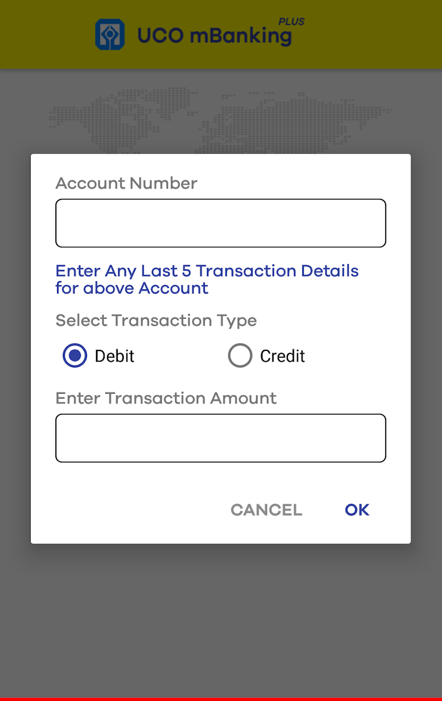
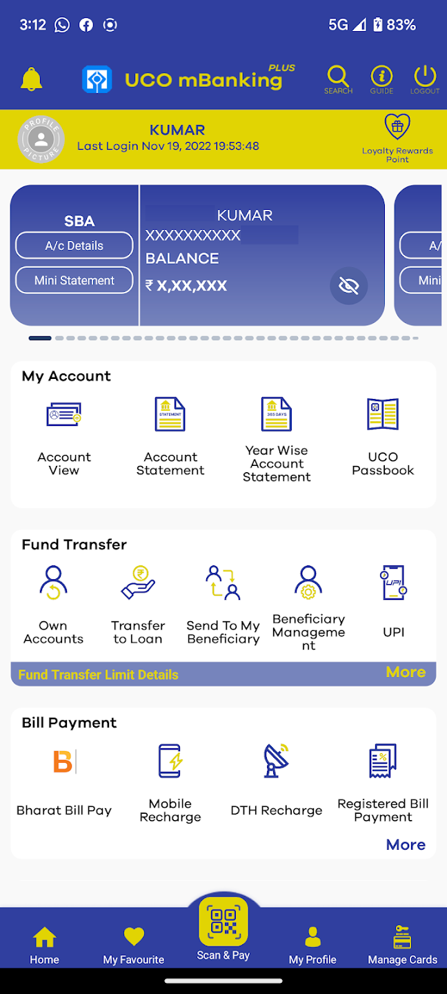
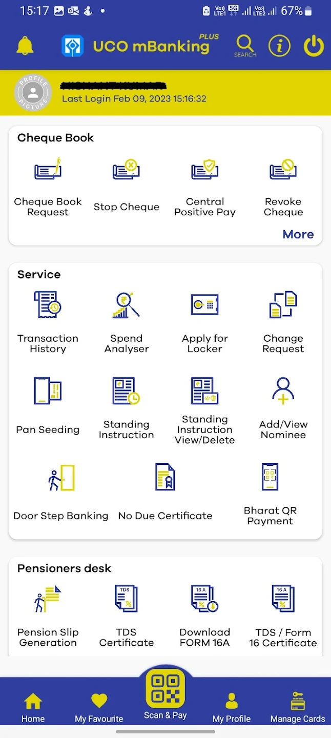
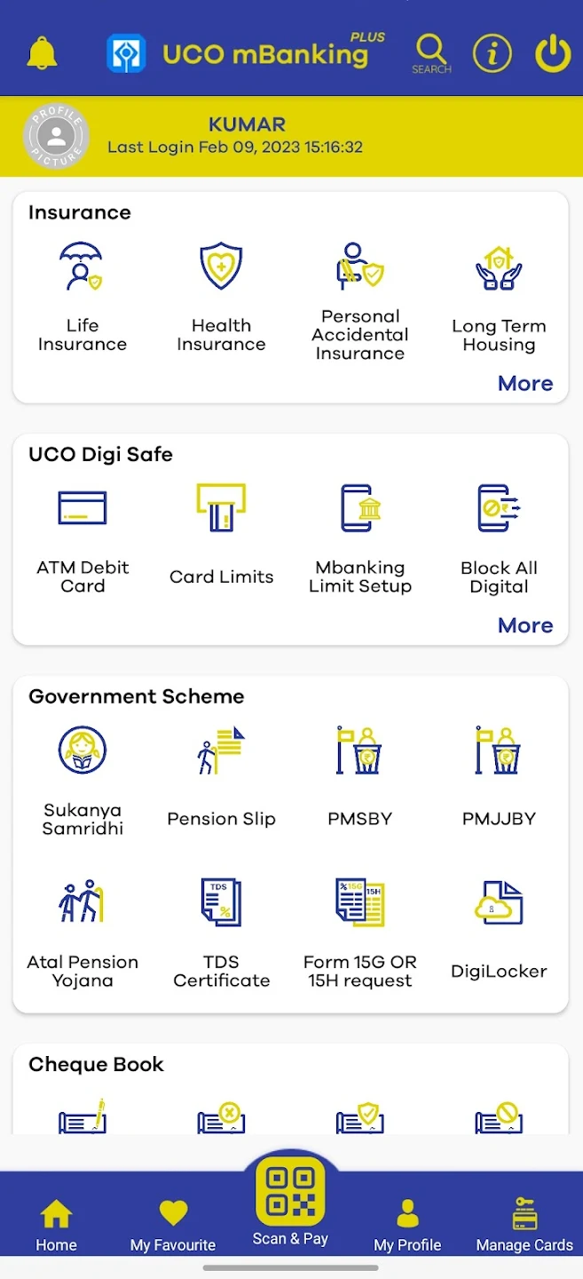
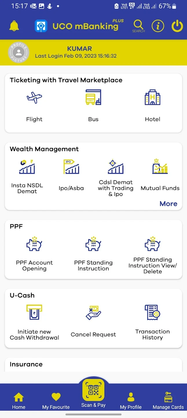
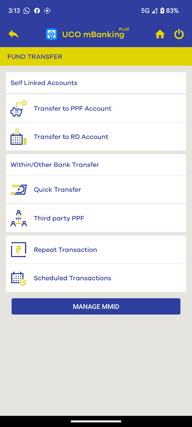
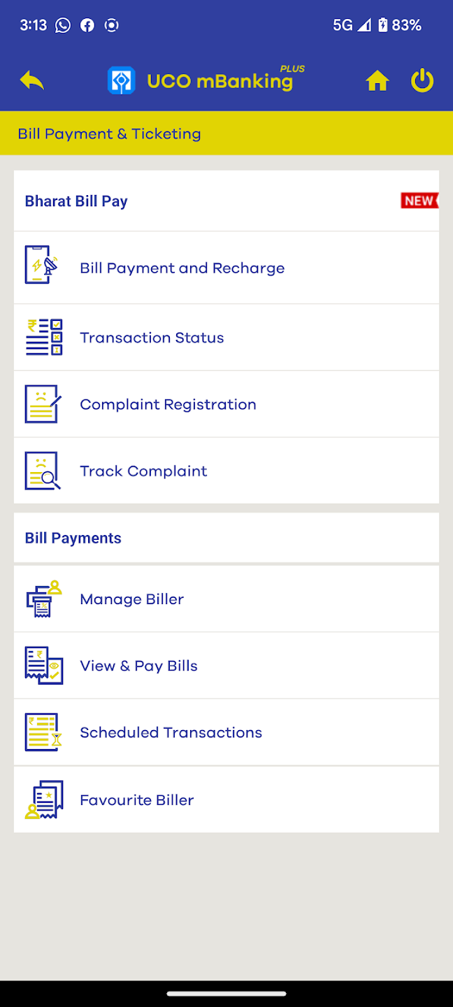
Screenshots of UCO mBanking Plus App, Source: Google Playstore
General Emotions of Users towards the Application


General categorization of my Userbase as studied from Bengaluru, Karnataka. Experience from previous postings in Dhanbad and Ranchi, Jharkhand has also been taken into account here. The reviews from Google Playstore have also been considered for reference.
Defining our Problem Statement : 5 Why's Approach

Problem Statement: Preserving the Comprehensive features of UCO mBanking Plus Application, while creating a Minimalistic and Accessible User Experience.
Ideation and Brainstorming on the Design
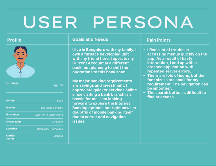
User Personas


User Journey

User Flow and Information Architecture
Prototyping the Design
Mood board, Storyboard


Low-fidelity Sketches


Brainstorming different layouts and factors to consider in the design.
First design Iteration


Second design Iteration


High-fidelity prototype
Evaluating the Future
Inspirations
Here is a very interesting Article on building Financial Applications by Nielson Norman Group, which served as an anchor and inspiration to this Project: https://www.nngroup.com/articles/vanguard-mobile-app/
Another one of my favorites is this Article from the same source, which discusses why clarity of thoughts is a precursor to efficient decision making. This article has a huge influence on the criticality of this Project's problem statement: https://www.nngroup.com/articles/sludge-decisions/
Comentários